

|
| |
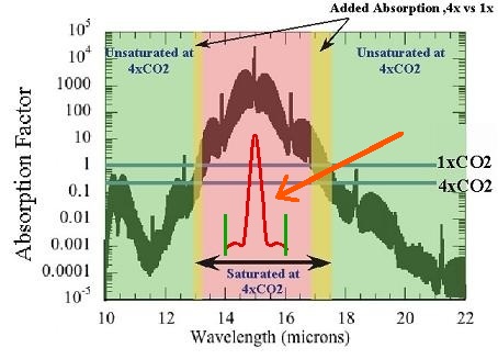
This graph is engine noise from a propeller aircraft during World War Two. Idiots assume it is an absorption spectrum for carbon dioxide in the atmosphere. Incompetents in climatology like to use this engine noise graph (not knowing what it is) as a quantitation tool, because they can get numbers from it. They had to go back to WW-II to get engine noise, because now days noise is shielded out of measuring devices.
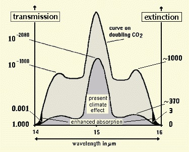
The absorption spectrum for CO2 is a bell curve, not a sine wave. I added the CO2 absorption spectrum in red. Notice the difference in bandwidth. The CO2 graph has an invariable boundary between 14 and 16 microns which includes the shoulders on the curve. The engine noise extends far beyond those boundaries. The engine noise graph is an oscilloscope trace loaded with harmonics. Absorption spectra are not produced with oscilloscopes and do not have harmonics with them. Below is an example of a measured absorption spectrum for CO2 by Heinz Hug, as shown on the global warming section of this web site.
The claim with the graph for engine noise is that the bandwidth widens with increased CO2 in the atmosphere. It does not. Only energy state of the molecules determines bandwidth, and it does not change with more being added to the atmosphere. Heinz Hug measured absorption with doubling of CO2 and showed that the bandwidth does not increase. Notice that the slope of the absorption spectrum used by alarmists is about 45 degrees of angle. This leaves a lot of space for change. But the actual absorption spectrum for CO2 is nothing resembling this. The edges are sharp. The atmosphere doesn't represent anything close to an absorption spectrum for a single gas such as CO2. After radiation goes through several kilometers of atmosphere it is influence by a large number of unknown factors including scattering and absorption by any number of unknown substances and overlap between gases. The engine noise graph is not a properly scaled representation of anything. It's designed to catch the eye of the unwary, much like the fake hockey stick graph. Oddly, they multiplied the CO2 level by a factor of four, where the usual question is what happens upon doubling of CO2. Then the lines across the graph for 1X and 4X have no meaning. They don't intersect with anything relevant on the graph. The 1X line is arbitrarily placed at one absorption unit, and the 4X line is placed at the 0.5 absorption units, while the peak is at 10,000 absorption units. So how do they know that the increase will widen the effective absorption by almost one micron of wavelength? There is nothing on the graph or anywhere in science which will tell them that. |
| |||||||||||||||||
 |
 |
||