The Wikipedia entry also states that 15-30% of the radiation which leaves the surface of the earth goes around greenhouse gases. Combining this with Hansen's graph, 70-85% of 41% is 29-35% of the earth's heat. Combining this with the 33°C indicates that 10-12°C (not 33°C) is the amount of atmospheric heat that would be attributed to greenhouse gases.
Carbon dioxide absorbs 8% of the total (black body) radiation. With Hansen's claim that 41% of the heat leaving the surface of the earth is radiation, 3.28% is due to CO2. If the atmospheric total is 33°C, 1.08°C is how much heating CO2 would have done before human influences.
But the 41% radiation should be 1-5%; say 3%. The greenhouse effect then reduces from 10-12°C to 0.73-0.88°C, not the 33°C repeated over and over on the internet.
In reality, these are proportionality errors in the claimed science, as greenhouse gases cannot heat the atmosphere because of equilibrium and saturation.
Temperatures Equilibrate
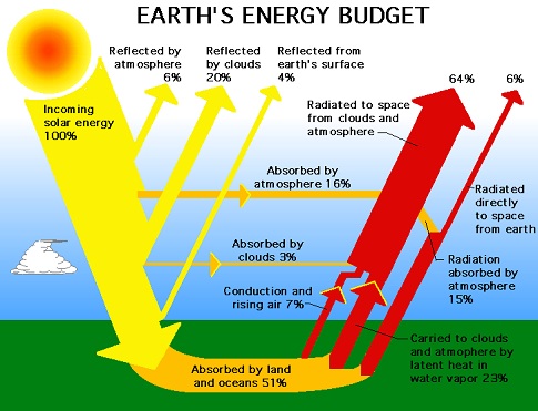
Such numbers would indicate that greenhouse gases do something, except that it is not true, because heat is not an additive effect; it equilibrates. The planet is cooled by radiation which goes around greenhouse gases, not through them. The escaping radiation cools the planet to a level where the same amount of energy leaves as enters from the sun, which is said to be 235 W/m˛. A particular temperature will liberate that much heat independent of how the heat gets into the atmosphere. Most of the radiation leaves from the atmosphere, since radiation leaves a transparent gas much easier than it leaves the surface of an opaque solid. Notice in the NASA chart above that ten times as much radiation leaves from the atmosphere as from the surface of the earth.
In other words, the effective temperature which liberates 235 W/m˛ is independent of how heat enters the atmosphere. It will be the same temperature at 10% conduction and 90% radiation as it will be at 90% conduction and 10% radiation. Therefore, the temperature is independent of greenhouse gases.
Back Radiation as Settled Science
The second most significant point in the minds of global warming alarmists is the Kiehl-Trenberth chart (Jeffrey T. Kiehl, Kevin Trenberth (1997): Earth’s Annual Global Mean Energy Budget; in Bulletin of the American Meteorological Society, Vol. 78, No. 2/1997, S. 197-208). This chart applied the Stefan-Boltzmann constant (SBC) to energy dynamics, while Hansen's chart did not. The SBC says that the average surface temperature of 15°C will emit 390 W/m˛, which Kiehl and Trenberth showed. They forgot to take into account emissivity, which adjusts each substance for errors in the SBC, which would probably be a 10-20% reduction—impossible to determine. The SBC forced the analysis into absurdity, which may be why Hansen tried to ignore it. Numerous lines of evidence indicate that the SBC shows about 20 times too much radiation being given off at normal temperatures.
Starting with 390 W/m˛ leaving the surface, Kiehl and Trenberth had to show 350 W/m˛ being absorbed by the atmosphere and 40 W/m˛ going through. (Details Here) 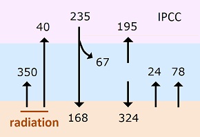 They showed 324 W/m˛ from atmosphere to earth, which had to be smaller than the 350 W/m˛ going in reverse. This left only 24 W/m˛ for conduction. That means 16 times as much radiation as conduction from the earth's surface. Nothing below the temperature of white hot metals produces 16 times as much radiation as conduction when exposed to the atmosphere.
The absurdly low level of conduction is ignored by alarmists, while they focus on the 324 W/m˛ radiating from the atmosphere back to the surface of the earth. They say this shows how "back radiation" heats the surface after greenhouse gases absorb radiation. They picked up the term "back radiation" from a different analysis. It is only a relevant concern when the heat shows up in a zone near the top of the troposphere. When the heat is near the surface, any combination of radiation and conduction will do the same thing.
Saturation Pushed Climatologists into Minutia
Where the zone at the top of the troposphere comes in is in rationalizing saturation. No scientists deny that greenhouse gases saturated at low concentrations. This means a small amount of greenhouse gases absorbed all radiation available to them, so more of such gases cannot absorb more. To sustain the global warming hoax in the face of saturation, rationalizers claim that the shoulders of the absorption peaks are not saturated, and global warming is caused in those areas.
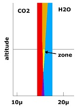
There are only three narrow absorption bands for carbon dioxide, so that only 8% of the total infrared band of black body radiation is absorbed by CO2. One side of the main band overlaps with water vapor. But the two bands separate in the lower density of the upper atmosphere. Therefore, some alarmists scientists theorize that the critical heating occurs in the upper troposphere, and in some mysterious way "back radiation" brings the heat back to the surface of the earth against a large temperature gradient. No increase in temperature has ever been found in the upper troposphere.
Hide the Decline—Again
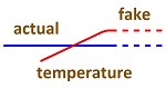
While scientists argue such minutia, non-scientist alarmists consider the science to be settled, and therefore, they cannot be wrong in seeing global warming in news events, weather related or otherwise. But the graph for measured global average temperature has not been showing the smooth upward curve which models predict. The claimed measurement graph shows 1998 to be the hottest year ever, with a leveling off afterwards and some cooling over the past 5 years. Governments are now telling the IPCC to hide the recent leveling of temperature, so deniers do not have additional tools to bolster their arguments. One stated logic is that only long-term trends should be considered. Why isn't that argument being made everytime some heat wave shows up? If the curve is not smooth, then something other than greenhouse gases is influencing the result.
Falsified Temperature Measurements
Satellite measurements show no significant average, global temperature increase for as long as satellites have been making such measurements (about 30 years). So alarmist climatologists require that satellite measurements be adjusted to fit land measurements. One claim is that satellites slow down in a thin atmosphere, since they must be close to the earth. But slowing down would mean that their measurements are too high, not too low. Some studies show that the "urban heat island effect" is large enough to account for the entire claimed temperature increase. But not all studies agree.
In 2010, Joseph D'Aleo and Anthony Watts reviewed temperature data and concluded, "1. Instrumental temperature data for the pre-satellite era (1850-1980) have been so widely, systematically, and unidirectionally tampered with that it cannot be credibly asserted there has been any significant “global warming” in the 20th century. 2. All terrestrial surface-temperature databases exhibit very serious problems that render them useless for determining accurate long-term temperature trends. 3. All of the problems have skewed the data so as greatly to overstate observed warming both regionally and globally. 4. Global terrestrial temperature data are gravely compromised because more than three-quarters of the 6,000 stations that once existed are no longer reporting. 5. There has been a severe bias towards removing higher-altitude, higher-latitude, and rural stations, leading to a further serious overstatement of warming. etc."
This study was prompted by numerous critics around the world showing that temperature data for their area was being altered to lower earlier readings and show an increase, while raw data was showing no increase. (More Details Here)
General observations indicate that the surface of the Pacific Ocean was warming between 1978 and 1998 putting more moisture in the air, which was resulting in cooler summers and warmer winters. There was such an increase in precipitation in the USA that the corn belt moved farther west into prairie grasslands. Then the surface of the Pacific Ocean got colder, summers got warmer and winters got colder.
In other words, all evidence indicates that nothing basically changed over the past 35 years but the temperature of the surface of the oceans. More sunlight will be reflected away when warmer oceans put more water vapor into the air. So it is quite likely that there was a slight cool-down from 1978 to 1998 rather than a warm-up in the atmosphere, but other oceans were probably not following the temperature change of the Pacific. The only reason why the graph for average global temperature stopped increasing is probably because recent temperatures cannot be falsified as older temperatures can, and the graph now shows the real result of a stable average temperature.