|
| Gary Novak
The Cause of Ice Ages and Present Climate |
How the Hockey Stick Graph Was Contrived
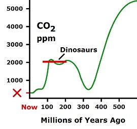
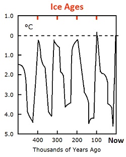
From the perspective of real science, it doesn't make a diddly bit of difference what temperature graphs show for two major reasons: One, laws of nature supersede human science showing that there is no such thing as a greenhouse gas. And two, nature produces huge amounts of variation in every element of climate without greenhouse gases. The assumption that nature is flat and comfortable is extreme stupidity, as shown by the carbon dioxide graph and the ice age graph.
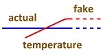
Fakes in science needed a representation of global warming which could sway the masses, and they found it in a hockey stick graph which the IPCC used as its primary showpiece. It's called the hockey stick graph because it is a straight line which bends up on the end. It's supposed to represent global temperature over the past thousand years with a sharp increase in the twentieth century due to human activity.
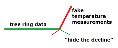
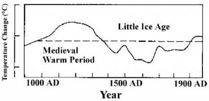
When critics saw the hockey stick graph, they knew something was wrong. So Steve McIntyre, a mathematician, attempted to reproduce the graph from the original data. His first problem was that the authors would not make the data available. In years gone by, all data would be included in a scientific publication; but nowdays, too much paper would be required, so scientific publications are little more than sales pitches with about as much objectivity as a soap advertisement. In the spirit of godliness, all scientific journals require that data be made available to other scientists; but this is nothing but an image booster which is ignored in practice. So critics of the hockey stick graph were denied access to the data. Therefore, what Steve McIntyre did was go through the statistical analysis and show that it incorrectly showed a significance where there was none. The original authors then published more such work attempting to bolster and justify their methodology. Eventually, they published in a journal which required them to make their data available. McIntyre took the data and showed that when all of it was properly evaluated, there was no hockey stick bend on the end representing the twentieth century and human activity. The counter-argument of the original authors is that they just took whatever data seemed appropriate, which is not cherry picking the data. But the absurdity of it is that getting a straight line for the past thousand years shows that they did not have a scientific measurement to start with. The original authors used tree ring measurements as a "proxy" indication of temperature. Usually, tree ring width indicates other things which influence growth besides temperature, but in this case the trees were located in the Urals of northern Russia, where temperature is assumed to be the limiting factor of growth. The fact that the line was straight for a thousand years shows that the tree rings being measured were not a suitable indicator of anything. I would go farther and state that temperature changes in the far north are not a valid indication of global temperatures. This point was demonstrated over the past year in the northern USA, where all records were broken for cold temperatures in 2009, while global temperatures were said to be increasing. The obvious reason why northern temperatures can be colder while global temperatures get warmer is because northern temperatures are determined by ocean currents which are highly variable in moving through the Arctic. The ocean currents which flow through the Arctic only influence a small area, not the whole globe. This means that measurements of tree rings from the far north would not be an appropriate indicator of global temperatures. But regardless, the published measurements showed nothing, and the obvious reason is because the growth of the ancient trees being studied does not correlate with temperature, global or northern. Such factors as overcast and sunshine would probably be more relevant than temperature, but none of the causative factors were properly studied. An earlier hockey stick graph was created for carbon dioxide by using ice cores. Ice cores are worthless for CO2 because of instability and no reliable method of extracting the gases in their original ratio. But criticism of the procedure was not allowed. (Fake Ice Core Data) Notice this monumental fraud. If a flat graph going back a few centuries means nothing caused climate change but human activity, the same would also have to be true for the past four billion years of geological and biological history. Otherwise, whatever caused change in the past could be what is causing it now. All long term graphs show up and down peaks which never end. They never show anything flat. So the hockey stick graphs are contradicting long-term trends in attempting to propagandize the public. The purpose of hockey stick graphs is to make the statement that nothing in nature changes these factors, only human influences do. That purpose is fraudulent. Earlier heat and CO2 had to get into the atmosphere through natural conditions. The counter-argument of alarmists is that the medieval warm period and little ice age only occurred in the northern hemisphere, while the global average temperature was stable. Why would temperatures of the northern hemisphere be constantly changing, while the global average is stable? Temperatures in the southern hemisphere would have to be doing the opposite to create a stable average. Both hemispheres constantly changing doesn't point to a stable average. Frauds have succeeded in convincing most of the public that there is a stable and unchanging set of conditions which has never varied in biological history, and humans are changing it to the detriment of all life. Hockey stick graphs have that fraudulent purpose. You think I make this stuff up? This is what modern science has become. First Stage: statistical fraud in the hockey stick graph — Bishop Hill Explanation of hockey stick graphs — The Air Vent Documenting the Medieval Warm Period at CO2 Science Org Court Case Thrown Out, August, 2019
|
|||||||||
 |
||||||||||